

A local e-commerce tackle shop specializing in high-quality, field-tested gear tailored for Pacific Northwest fisheries.
Seattle Fishing Co.
A website redesign that streamlines the user experience for both new and experienced anglers to easily find the right gear to catch their favorite fish.
Objective
Figma
Miro
Illustrator
Photoshop
Lightroom
Shopify
My Role
Tools
Research
Prototyping
Branding
Visual Design
Developer
Duration
4 Months
The Challenge
As a novice angler, I experienced firsthand how overwhelming it can be to shop for fishing gear online. For example choosing the right rod to selecting the appropriate fishing line for your reel, each component serves a specific purpose and must be matched to your target fish. This complexity creates a significant barrier for beginners trying to enter the sport.
In addition, when it comes to shopping online. There’s a lack of information, features, and filters that helps guide users towards the appropriate gear.

Solution

As a lead designer at Seattle Fishing Company. I proposed a streamlined user flow that helps guests find the right gear based on the fish they’re looking to target. By curating a tailored selection, similar to how a sales associate would provide recommendations at a physical store.
This would allow guests to build confidence that they’re viewing the appropriate products that is tailored to their needs. To which they could select by size, color, and weight.
Key Features
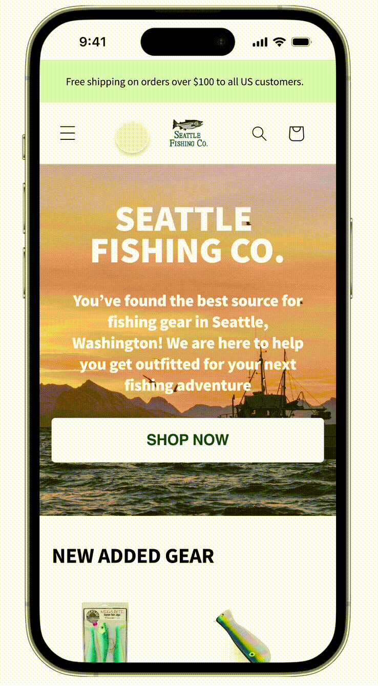
The simple and easy to follow navigation helps new and currents guest to quickly shop for the right gear base on the targeted fish they’re looking to catch. Which is divided by Freshwater and Saltwater fish.
Efficient Navigation
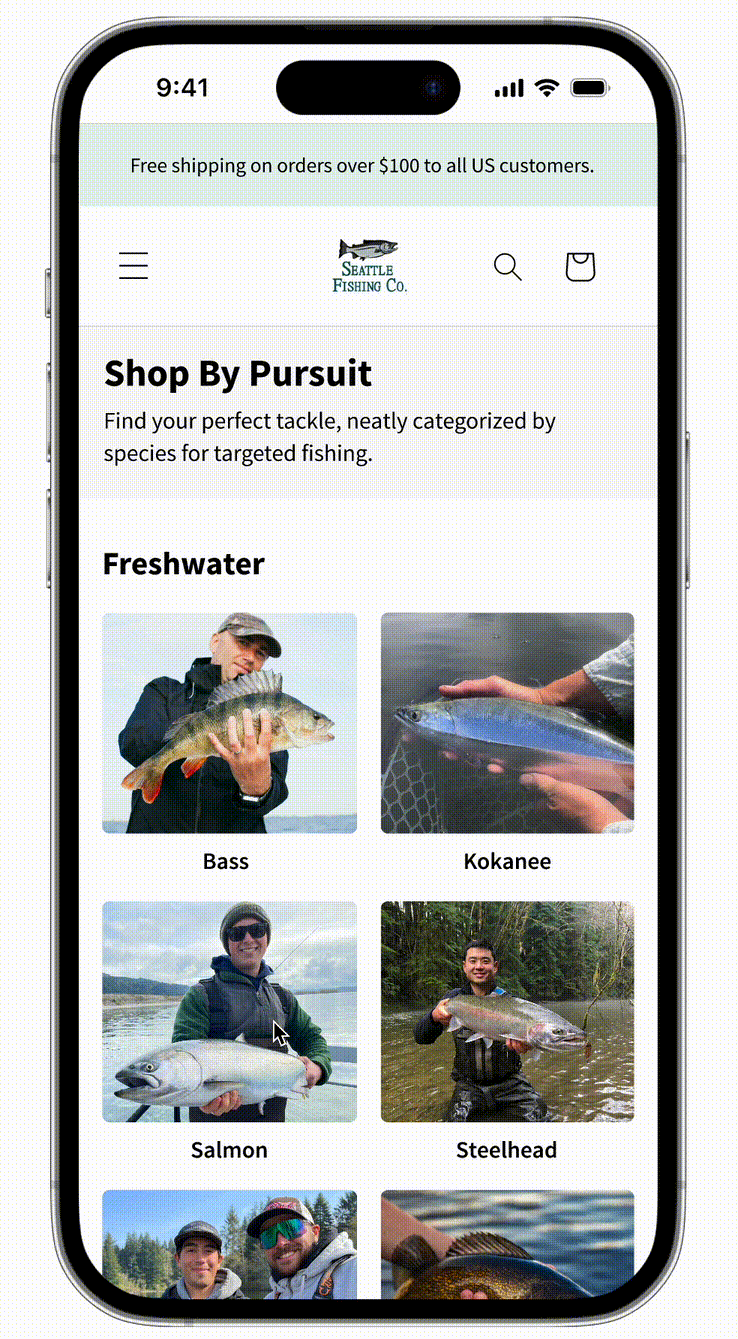
Shop by Pursuit presents the guest high-quality images that are organized by species to guide and simplify the selection.
Species Catalog

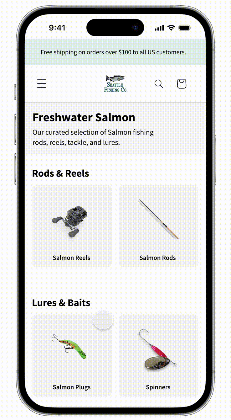
After selecting the type of fish they’re looking to catch (freshwater Salmon). The guest are then presented by a curated selection that is only used for that specific fish. In addition, the product images are thoughtfully selected as a recommendation to increase fishing success rate.
Curated Selection
The heading includes information about the products and what they’re used for. It’s also an opportunity to boost SEO traffic when keywords are applied.
Educational Stations
The product page contains multiple product shots as well as real-world scale for reference. By providing a scale the guest are able to visualize the dimensions of the product before making a purchase.
Description also includes recommendations, function, and practical guidance. Reassuring that they’re buying the right product
Detailed Product Page

Research
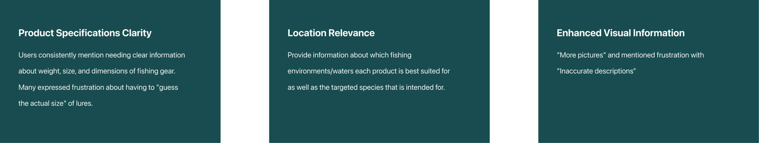
I ran a survey questionnaire inquiring about peoples experience when it comes to shopping for fishing tackle online to understand about their pain points and what would overall improve their experience.
Qualitative Interviews

Insights
Market Analysis

I selected three major box stores that sells fishing gear online and studied how the products are presented to the customers as well as how intuitive their filtering system are across all product line.
While all three stores provided great a plethora of product selection. They all could benefit from improved discoverability and product descriptions.
Orvis
Orvis uses a structured step by step navigation that distills down saltwater and freshwater fishing.
The fly selection filter is robust, narrowing down both fish species and fly type to help users easily find the right jig.
However, when it comes to selecting fly line like leader & tippet it loses the filtering system of which species they’re best used for. This is important for fly presentation and line pound strength.
Lacks size and weight in the product page.
Analysis:
Takeaways:
Orvis excels with step-by-step fishing navigation and comprehensive fly filtering by species/type, but lacks consistency between product pages and could benefit by providing weight and size of the fly.

Cabela’s
Offers a “Shop by species” option for certain categories for lures but not for line, hooks, weights.
The saltwater fishing category is too broad, combining species like salmon, trout, squid, and halibut under the same product collection.
Users can only filter by brand, size, availability, and rating making it hard to find specific gear.
Product page includes a selection of weights but is missing the size dimension.
Analysis:
Cabela’s provides species filtering for lures but not line, hooks, or weights. Its overly broad saltwater category combines diverse species, while limited filtering options hinder specific gear discovery. A great selection of weights and colors but it’s missing the size.
Takeaways:

Sportsman’s Warehouse
Sportsman’s Warehouse has a dedicated page for saltwater gear (rods, lures, reels, tackle), providing clarity on where the gear is used.
All saltwater lures are grouped together, without specifying which fish they are best suited for.
Limited filtering options; category, brand, color, and price.
Most of the product descriptions highlights the technical feature rather than intended use and dimensions.
Analysis:

Sportsman's Warehouse offers dedicated saltwater sections but lacks species-specific lure guidance. Limited filtering options and technical-focused descriptions prioritize features over practical usage information.
Takeaways:
Design


I designed two archetypes to serve as a pillar to represent the users needs and behaviors. This allows me to align solutions base on how the users would interact with the product, that I’ve gathered from market research and interviews.
Archetypes

This is my visual aesthetic party board to tell a story of what the new website redesign could potentially look like by providing typography, colors, buttons, and images. This helps my manager see and feel the vision for the brand.
Stylescape

As a bonus to working on streamlining the shopping experience for Seattle Fishing Co. I’ve also introduced a set of standards and guidelines to ensure cohesive branding and visual identity across all platforms through desktop and mobile.
This involved selecting a typeface that ensures clarity and readability. As well as, making sure the colors feel friendly to convey an overall positive experience with the brand.
Design System


As an extension with the brand colors. I’ve analyzed the color contrast ratios to ensure that background and text would meet the WCAG (Web Content Accessibility Guidelines) standards for readability.
Web Accessibility

I’ve introduced a set of icons in the product page to enhance visual communication for free shipping, stock, and product credibility. As well as to increase trust and transparency for our guest that they will receive their order.
Iconography
Wireframes
The following screens are showing two versions of ideal path for the guest that are based on the collected data using Microsoft Clarity heat map. I am showing what the user flow would be like to shop for targeted species for mobile and desktop.


This is a path using the navigation bar to guide the guest and narrow down to what type of fish they’re looking to catch. Which is followed by recommendations of tackles to increase their success rate.
Mobile
For the desktop version I’m using the CTA at the hero section to guide the guest to the Pursuit page. Where they can select the type of fish they’re looking to target. For this example I’m showing the flow of what it would be like to purchase a freshwater salmon spinner.
Desktop

For usability testing I asked my classmates and professor who has limited knowledge when it comes to fishing to perform a series of task. These task involves how they would navigate the website to find a specific tackle and what areas I could improve upon.
Testing
The users preferred using the navigation bar over the “Shop now” button.
While having “Freshwater” and “Saltwater” as a visual subheading. It didn’t have any impact of making there selections.
They appreciated the card-based product navigation and found it easy to use.
Felt the title and product description provided enough information, even with limited fishing knowledge.
A recommendation of how the tackles, line, etc. would work together would be nice to have as a beginner.
Rated the experience 8/10 for ease and speed in finding a species and products.
Feedback
Takeaways
Balancing both roles as a designer and developer while learning a new platform, Shopify, has tested me to explore the limits of my designs within Shopify's parameters. This experience taught me to balance what’s possible and feasible.
Design Limitations
Happy Path
Sometimes, the path you prefer isn't the most effective. During usability testing and heat map analysis, only 25% of users clicked the “Shop Now” button. The users have preferred the navigation bar when looking for specific information.
I learned not to become too attached to my designs, as there is always room for improvement and fresh perspectives that will get me closer to an even better solution. Things will move around and iteration is part of the process.
A Better Solution
This freelance UX design job has challenged me to strengthen my critical and creative thinking skills by prioritizing user needs and their pain points to create an effective solutions. Working at Seattle Fishing Co. allowed me to observe and understand the complete user journey, from initial navigation to checkout. I am grateful for this opportunity and the valuable experience it has provided as a designer.
Reflection
I would like to present my prototype to the people who enjoys fishing as their hobby to gain another insights to improve the product.
Add the scale feature to all the products that are listed and include actual size dimensions in the descriptions. Which will involve research and measuring all products.
Expand the pursuit page and add more fish that are available to catch here in the Pacific Northwest.
Next Steps