A conceptual all-in-one travel app for planning and booking group getaways with your girl friends and family.
Girls Trip
To create a convenient, digital-first platform that redefines group travel planning by integrating streamlined booking, secure payments, and in-app messaging, ensuring that only confirmed travelers are part of the experience.
Objective
Planning a group trip is often complicated and time-consuming, requiring months of coordination. From organizing activities to booking accommodations, the process can be overwhelming. Managing payments adds another layer of stress. It’s challenging to ensure everyone pays and contributes which leaves planners unsure who’s truly committed.
The Challenge
6 weeks
Duration
Developer
Dot Hollobaugh
Avila Armstrong
Figma
Illustrator
Photoshop
VS Code
My Role
Prototype
Research
User Flow
Branding
UX Designer
Tools
Solution
Girls Trip is a mobile app that simplifies group travel planning with streamlined booking, in-app messaging, and secure upfront payment collection.
It solves coordination problems, communication breakdowns, and payment awkwardness common in group travel. Girls Trip aimed for millennial and Gen Z combines all planning tools in one platform, making group getaways stress-free.
Key Features
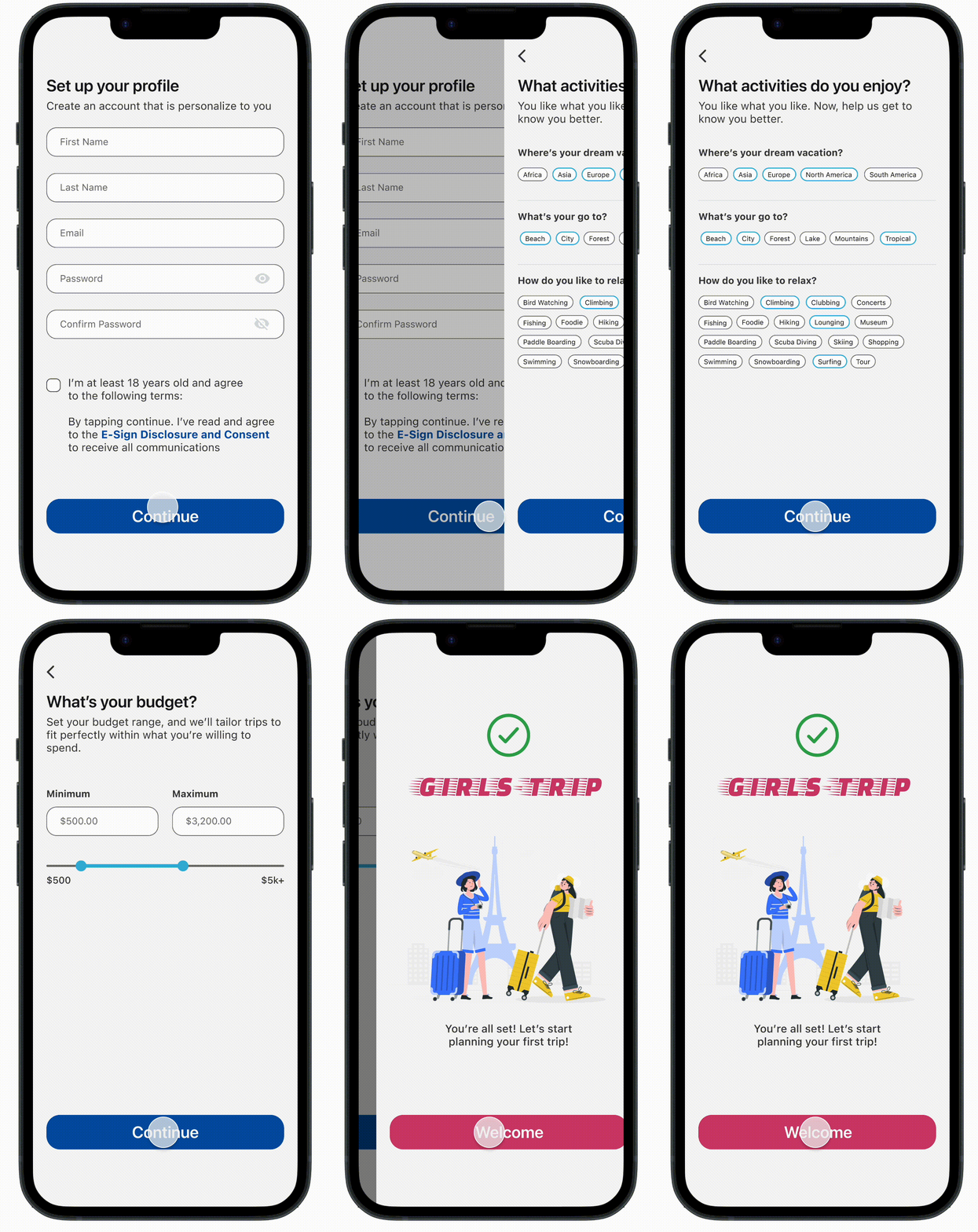
From the start, our goal is to personalize the user experience based on preferred destination, interests, and budget. This helps us understand our audience and offer tailored recommendations.
Onboarding
Packages are designed for small groups (2–4 friends), including flights, hotel, and activities. Everything’s pre-arranged making planning effortless and fun.
Curated Deals
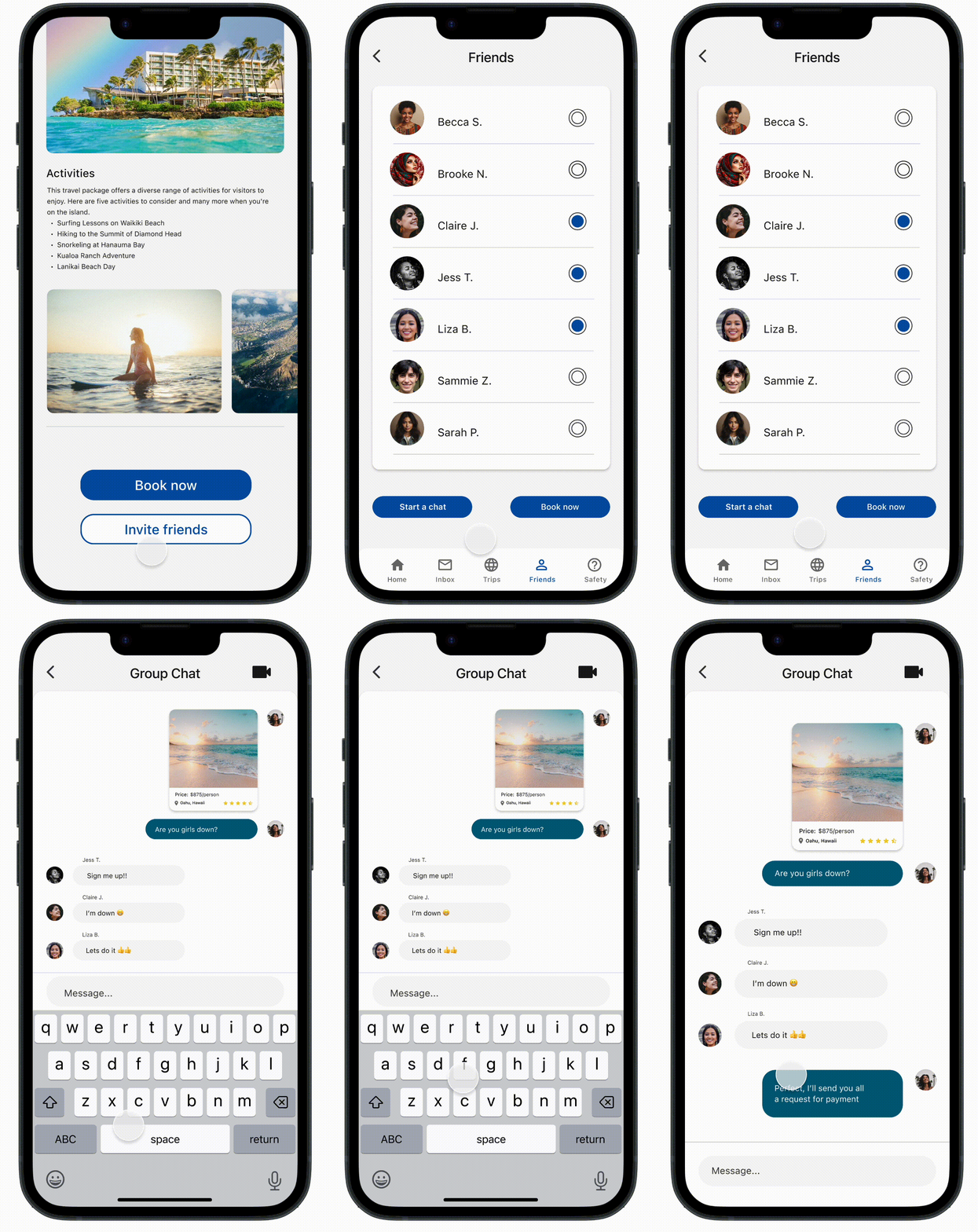
Plan trips together in real-time without switching apps. You can start a group chat with your friends to share deals and coordinate plans.
In-App Messaging
Packages are designed for small groups (2–4 friends), including flights, hotel, and activities. Everything’s pre-arranged making planning effortless and fun.
Group Payment Request
Research
I looked at three companies to identify gaps in existing travel and payment platforms. To help me understand the user pain points in group trip planning and offer an alternative all-in-one solution.
Market Analysis
Insights
For this group project, we were required to design a landing page that highlights the key features of Girls Trip. This landing page will then be linked through a social media ad campaign on Instagram that targets those who enjoy traveling and making memories with friends/family.
User Journey
We designed our archetypes around Gen Z and Millennial travelers who enjoy group trips and have the means to travel comfortably. Whether you're the planner or just along for the ride.
Archetypes
Wireframes
Before designing our initial prototype. We designed a low-fidelity version of the app that highlights that would include our main key features which is messaging, sharing, and travel packages.
Mobile App Wireframe
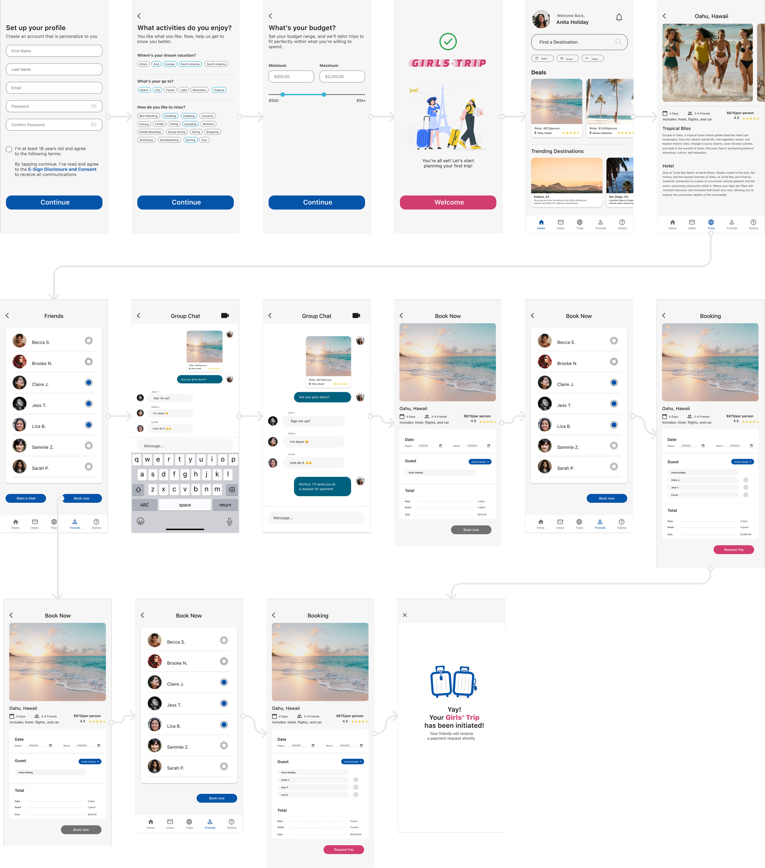
For the second version of the wireframe I focused on taking the ideas from version one and expanding it to mid-fidelity as a prototype mockup.
With the onboarding process I used the same mental model when creating a profile on a dating app like Tinder and Bumble. Mostly highlighting what they’re interested and using a pill to quickly select their interest. Which will then personalize their app experience.
Version 2
After testing version 2.0, we had received feedback about accessibility concerns. While the colors in the previous mockup felt light and airy, I as the designer had failed to consider the color contrast for accessibility.
I found that only 36% of my initial color combinations met the WCAG (Web Content Accessibility Guidelines). By adjusting the brightness and saturation, I was able to increase the number of compliant color combinations to 50%. This gave me more design flexibility while ensuring the interface remained accessible to all users.
Another addition was a visual slider when selecting a budget. This allows for quick adjustments without having the user type, making the experience more interactive and efficient. Furthermore, I also added pre-filled values to guide users on the expected input range to help reduce cognitive overload
Version 3
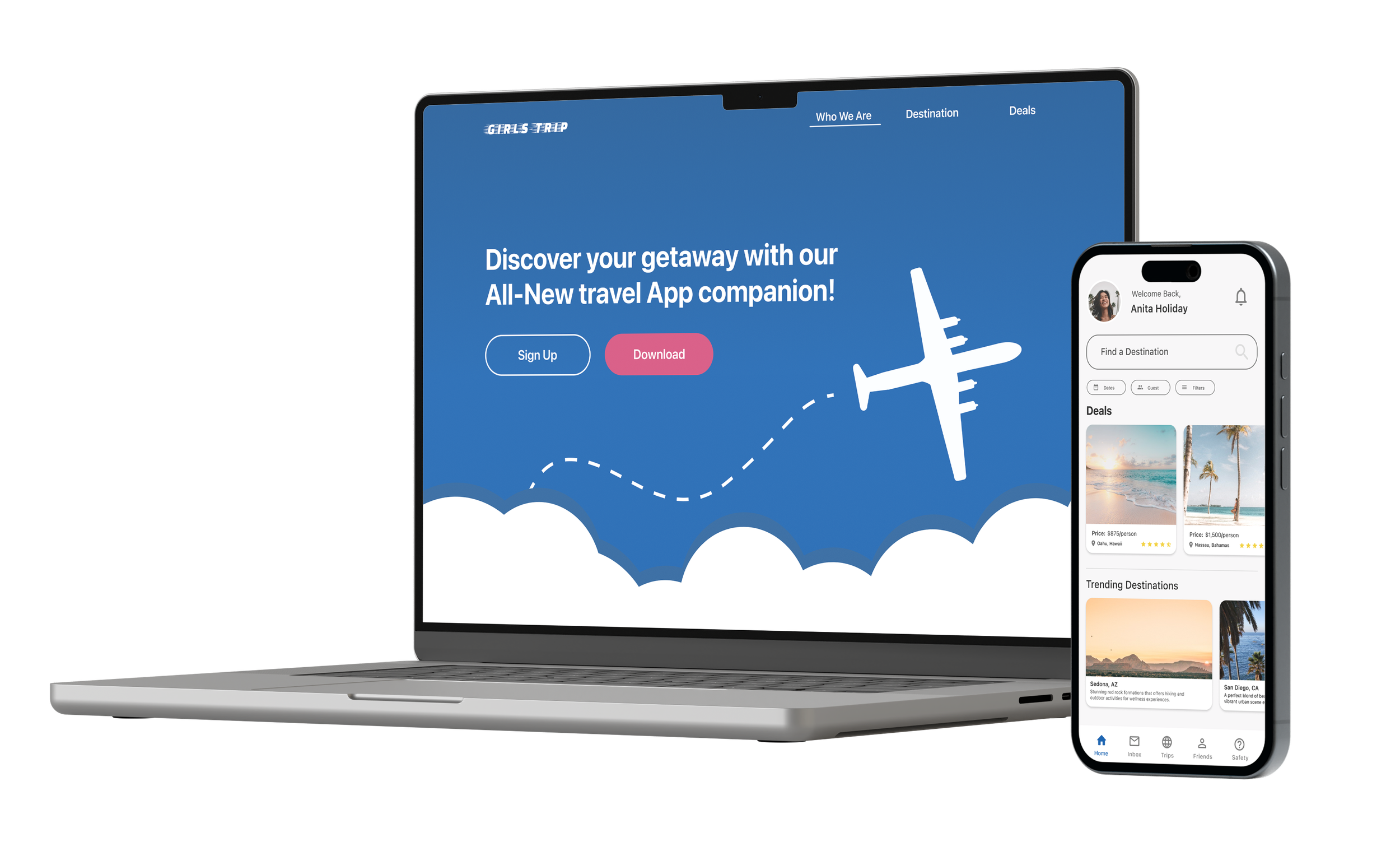
Designed for our targeted audience who enjoys traveling with a group of friends and family. Our guest are directed to this specific page when they engage on our social media ad or sponsored post via instagram.
Landing Page
Takeaways
After overhauling the color palette for both the website and mobile app, this project helped me understand the importance of color contrast. Designing isn’t just about visual appeal t’s also about ensuring accessibility and meeting WCAG standards.
Color Contrast
In our first iteration of the landing page, we aimed high by including a parallax effect for the clouds and airplane. However, due to time constraints and limited coding knowledge, we had to scale back during development.
Website Prototype
A Lesson in Mobile Design
This project offered invaluable insights, starting with a website landing page to promote a product and expanding to a mobile app. My team and I tackled key challenges, such as designing a personalized onboarding experience that feels intuitive by referencing dating apps, integrating messaging for seamless trip planning with friends without leaving the app, and creating a streamlined payment flow to simplify split cost among travelers.
This was my first time building a mobile app from scratch, and it became a great learning opportunity. I gained insight into designing for one-handed use by making primary buttons easy to reach, establishing hierarchy by prioritizing essential content, and maintaining consistent navigation across screens.


